What this logo was built to say.
Logo story, correct usage, prohibited uses, and typography — every guideline related to our logo is defined on this page.
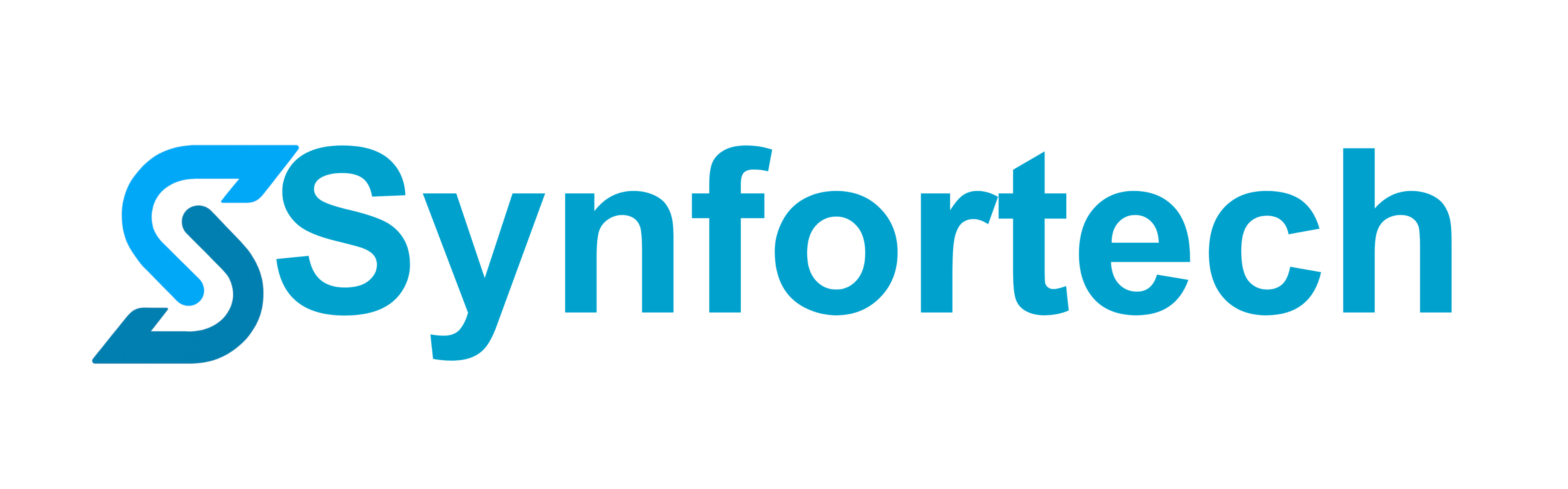
The story of our logo.
"Syn" means resonance.
The "Syn" in Synfortech derives from the Greek prefix "syn" — meaning "together." Technology and people, users and companies, advancing together. That vision is inscribed in the logotype.
The font is Arial Unicode MS. Linear and intelligent without becoming rigid — a deliberate choice to balance the precision of a technology company with the warmth that stays close to people.
The "S" carries
the speed of now.
The symbol "S" holds a forward-driving energy, like an arrow. The pace of digital, the sharpness of a startup cutting through an era — the momentum a viewer naturally feels is entirely intentional.
We use this icon with confidence at all times. Because it embodies what it means to be Synfortech.
It is designed to function independently in any context — SNS profiles, favicons, app icons. Whether paired with the logotype or standing alone, it carries the same strength.
The right way to use our logo.
Always give the logo room to breathe.
To preserve logo legibility, maintain a clear space of at least 50% of the logo height on all sides. No other elements may enter this zone.
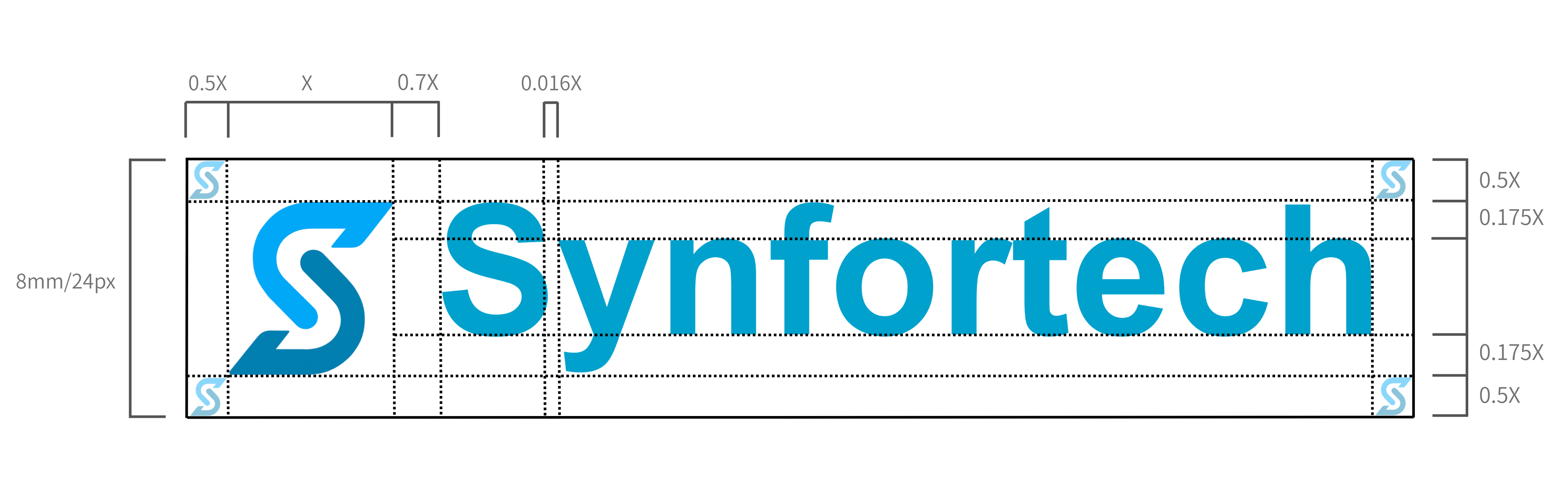
Respect the minimum display size.
Use the logotype at a minimum height of 24px, and the standalone icon at a minimum of 16px. Below these sizes, legibility cannot be maintained.
Choose the right logo for your background.
It may only be used when the brand color (#00A1CC) merges with the background and legibility truly cannot be maintained. All other uses are prohibited.
Nine things you must never do.
To maintain brand consistency, the following uses are strictly prohibited.
Never display the logo in any color other than the brand colors.
Never resize the logo by altering its aspect ratio.
Never tilt the logo at any angle whatsoever.
Never place the logo on a background where sufficient contrast cannot be achieved.
Never add drop shadows, glows, outlines, or any other effects.
Never layer the logo on top of images, text, or shapes.
Always maintain the prescribed spacing (0.7X) between the icon and logotype.
The logotype font is strictly limited to Arial Unicode MS. Changing it to any other font is prohibited.

Never embed the logo inline within a running sentence of text.
Type is also part of the brand.
Arial Unicode MS
The dedicated logotype font. When reproducing the logo in web or document contexts, this font must always be used. Recreating the Synfortech logotype in any other font is prohibited.
Noto Sans JP
The font used for body text and headings across our website and UI. It delivers high readability in both Japanese and Latin characters. Weight 900 (Black) for headings, 400–500 for body.
Please review before downloading
You must agree to the Logo Usage Policy
Synfortech Logo Usage Policy (Excerpt)
This Policy applies to all use of the logo marks, symbol marks, logotypes, and brand assets for which Synfortech holds copyright and other intellectual property rights.
[Permitted Uses] Limited to media coverage, introductory articles, educational purposes, and other uses expressly approved by the Company in advance.
[Prohibited Uses] Modification, processing, trademark use, redistribution, and fraudulent use are strictly prohibited. Legal action may be taken against confirmed violations.
[Attribution] When using the logo, you must clearly state: "This logo is the copyrighted work of Synfortech and belongs to Synfortech."
Synfortech Brand Assets
synfortech-brand-assets-en.zip
Logo Usage Policy + Full Logo Pack (SVG / PNG / JPG)
Agree to the Logo Usage Policy to enable the download button.